Monday, March 22, 2010

Postmodern

1975 - 1990
Originally used to describe architectural established and distorted designs such as the glass box design of the Swiss / International period, it became the term to describe visual wit, the embracing of art, fashion, graphic designs, architectural design, re-introduce the postmodernism interest in ornamentation and symbolism. Using pure geometry, Australia's most famous building, the Sydney Opera House, was inspired by Frank Lloyd Wright's use of abstraction and the ability to move away from pure geometry of the modernisms time.


Post Modernism is about mixing up and distorting what is normal AND challenging yoru expectations. For instance, the chair below is postmodern just because of its enlarged circular back. The abstract geometric shapes just add to it's style. (also, this was an Australian creation ☺)


The Memphis Group was founded in 1981 by Ettore Sottsass and some of his Italiant friends, to create "the inpersonal, slick, humorless design" of modernism. Vibrant, eccentric and ornamental were what described the fad this group created. Easy to see in this bookshelf below...

Late Modern

1945 - 1970
Inspired by avante-garde, the American innovations took over as artists used rejected and non-decorative approaches, creating a simplistic and popular acceptance. Artists emerged from all corners, such as Christian Dior. Yes he is french, but he still made a large impact in fashion and design world. Below, is his 40's and 50's new look, simplistic designs. The obvious parts of Dior's designs in this time were tightfitting pieces, and skirts and dresses following straight lines, most of the time incorporated together. In 1950 he created a new style, The Sailor suit. (the last one)

(all Christian Dior images have been found at www.topfoto.co.uk/gallery/Dior/default.htm )


Sensitive to his surroundings, and creating a new way of designing, Frank Lloyd Wright was one of the most influential, famous architectures in the design world of 1940's and 50's, and since he began his career. In the long time he lived (92 years) Wright had created some of the most beautiful architectural pieces in time, using the natural landscaped surroundings as his inspiration. He began architecture at the age of 18, studying and practicing his skills. By age 26, he began his own practice. He used an architectural language that was unique to the United States, and no look to the Europeans. He created homes...

He created businesses...

(interior of museum)

He created a home for county departments...


Over his 70 year long career, Wright had designed over 1,000 buildings which over 400 were built.
(all Frank Lloyd Wright information and images from www.designmuseum.org/design/frank-lloyd-wright )


Sunday, March 21, 2010

Swiss / International

1945 - 1985

Useful. Scientific. Corporate. Universal. Abstract. Just a few words to describe the Historians prefered style. Buildings made for industrial societies. Chairs were made to compliment homes. Things like cameras, record players and walkmans were boxy, along with the chairs and buildings of the time. The influential artist of the time was Josef Muller-Brockmann.


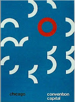
Geometry was big in the Swiss International era. Simple design with the use of geometric shapes combined. As the green poster above and in many of Josef Muller- Brockmann's posters. But Below, is the poster for the Tokyo Olympic games. It's not 'not much thought' put into this design, its the simple layout with the geometric rings entwined.


Repetition became popular in this design era. Unity was balanced with repetition in the images below, even in the titles of some.
Repetition along with geometric shapes create an abstract design.
One of the biggest designs, which has taken the world into a new way of seeing and understanding, is the signage system. It may be the most simplest design and inspiration from the Swiss/International period, but it is one that has stayed with us always. Originally abstract because of its minimalisms and symbols, the signage is used world wide. Everyone understands what they mean.

Saturday, March 20, 2010

Contemporary

1975 - present


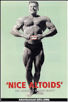
Some designs are just so well thought of and accepted, they never leave the eyes and homes of the public. Such as the Contemporary Look. This is the era of simplicity, classic taste, function before form, clean and asymmetrical layouts. Simple and straightforward designs and functions have never really gone out of style, such as the all-type approach where only words make the advertisement or piece of art. Even like the one below, by Paul Rand advertisement poster of IBM. He used pictures to sound out the letters. During 1975 and the present most artists and designers look back into history and find influences and inspirations in other design styles. Look at the few images below. Inspiration and influence by Art Deco, Swiss and Art Nouveau. Because over time, people have developed their own style, and what is in the media and presented to us needs variety, all the time. Even American Kitsch was used for advertising mints.
The simplicity of Contemporary art carries on today in advertising, layout and art and design.

Paul Rand was the influential designer of the time, helping to design trademarks such as IBM, Apple computers and more.

Humour was very popular in advertising, using the contemporary style. The following few images have humour incorporated with some of their simple advertisements.


e.g. bulldozing ☺


--

What I like in the contemporary style architecture and homes. I think if I lived in this room to long I'd become depressed, so I'd be changing the simple layout and colours every 6months or something, but I am a fan of the clear, uncluttered, simple style of the contemporary look.

Monday, March 15, 2010

Early Modern

1910 - 1935

Early modernism was a time when artists and designers broke from tradition to create a new style of design which would influence all artists, designers, architectures, fashions and literaturists around the world. Early modern artists were described as new or experimental, as they changed the way others saw design and art. Bauhaus created a new philosophy, putting a designs function before its form, something that has caught on and is used now. I believe this is the design era when abstract art became popular, with its geometric influenced, expressionist's outlooks and experimentational designs. Anything new, and different, rebelling against tradition was known as "modern". So this was the start of the rebelling against tradition that has carried through time influencing all the other art and design styles of the world.

First example is Pablo Picasso's "Man with Violin" in 1911. PIcasso and his friends created a new way of seeing. Using his abstract art he challenged the typical 400-year old traditional art.


Early modernists used Plakatstil's (poster styles), using flat colours. This emerged from Germany in the early 1900's for use in advertising. The Plakatstil design was first begun by Lucian Bernhard when entering a poster competition. He used to large drawings, and placed a clear bold title above the two drawings. The simplicity of the design won him the competition. Bernhard also designed furniture, wallpaper, factories and houses, as well as office buildings and light fittings. Other German artists began to use these simple designs, such as I.F. Reiser by Martin Lehmann-Steglitz. Plakatstil artists used distinctive colours.


(Plakatstil information on Bernhard and Lehmann-Steglitz by www.internationalposter.com/style-primer/plakatstil-posters.aspx )

Experimentation of design was not just used by artists, but also archtitectures. The following buildings all broke the traditional designs, and began creating buildings or all different shapes, sizes and angles. Such as the Einstein Tower by Erich Mendelsohn from Germany in 1921. The use of curves, irregular angles and asymmetrical design all link to the abstract type of art and design of the Early Modern era. Something I notice with these buildings is the use of bars on windows, as you can see with the Bauhaus highschool, Californian Hallidie Building and the Fagus Works in Germany. They all have large windows with some sort of bar or crisscross line in the glass.


Einstein Tower by Erich Mendelsohn.

Bauhaus HighSchool by Walter Gropius.


Fagus Works by Walter Gropius.

Hallidie Building by Willis Pork.


(information on the Hallidie Building and Fagus Works from www.gretabuildings.com/types/styles/early_modern.html )