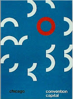
Useful. Scientific. Corporate. Universal. Abstract. Just a few words to describe the Historians prefered style. Buildings made for industrial societies. Chairs were made to compliment homes. Things like cameras, record players and walkmans were boxy, along with the chairs and buildings of the time. The influential artist of the time was Josef Muller-Brockmann.


Geometry was big in the Swiss International era. Simple design with the use of geometric shapes combined. As the green poster above and in many of Josef Muller- Brockmann's posters. But Below, is the poster for the Tokyo Olympic games. It's not 'not much thought' put into this design, its the simple layout with the geometric rings entwined.


Repetition became popular in this design era. Unity was balanced with repetition in the images below, even in the titles of some.
One of the biggest designs, which has taken the world into a new way of seeing and understanding, is the signage system. It may be the most simplest design and inspiration from the Swiss/International period, but it is one that has stayed with us always. Originally abstract because of its minimalisms and symbols, the signage is used world wide. Everyone understands what they mean.


No comments:
Post a Comment