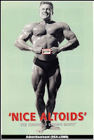
Some designs are just so well thought of and accepted, they never leave the eyes and homes of the public. Such as the Contemporary Look. This is the era of simplicity, classic taste, function before form, clean and asymmetrical layouts. Simple and straightforward designs and functions have never really gone out of style, such as the all-type approach where only words make the advertisement or piece of art. Even like the one below, by Paul Rand advertisement poster of IBM. He used pictures to sound out the letters. During 1975 and the present most artists and designers look back into history and find influences and inspirations in other design styles. Look at the few images below. Inspiration and influence by Art Deco, Swiss and Art Nouveau. Because over time, people have developed their own style, and what is in the media and presented to us needs variety, all the time. Even American Kitsch was used for advertising mints.
The simplicity of Contemporary art carries on today in advertising, layout and art and design.
Paul Rand was the influential designer of the time, helping to design trademarks such as IBM, Apple computers and more.
Humour was very popular in advertising, using the contemporary style. The following few images have humour incorporated with some of their simple advertisements.
e.g. bulldozing ☺
--


No comments:
Post a Comment